Minnesota Unemployment Insurance
-
The Problem
The website for Minnesota Unemployment Insurance contains a huge amount of information without clear organization. It is hard to locate information or troubleshoot problems when they arise, users can’t find what they need.
-
The Solution
Through research and user testing, I was able to reorganize the navigation and apply a visual style that makes the website pleasant and easy to use.
-

My role
UX/UI Designer
Individual Project
Tools: Miro, Zoom, Figma, Invision
Timeline: 5 Weeks
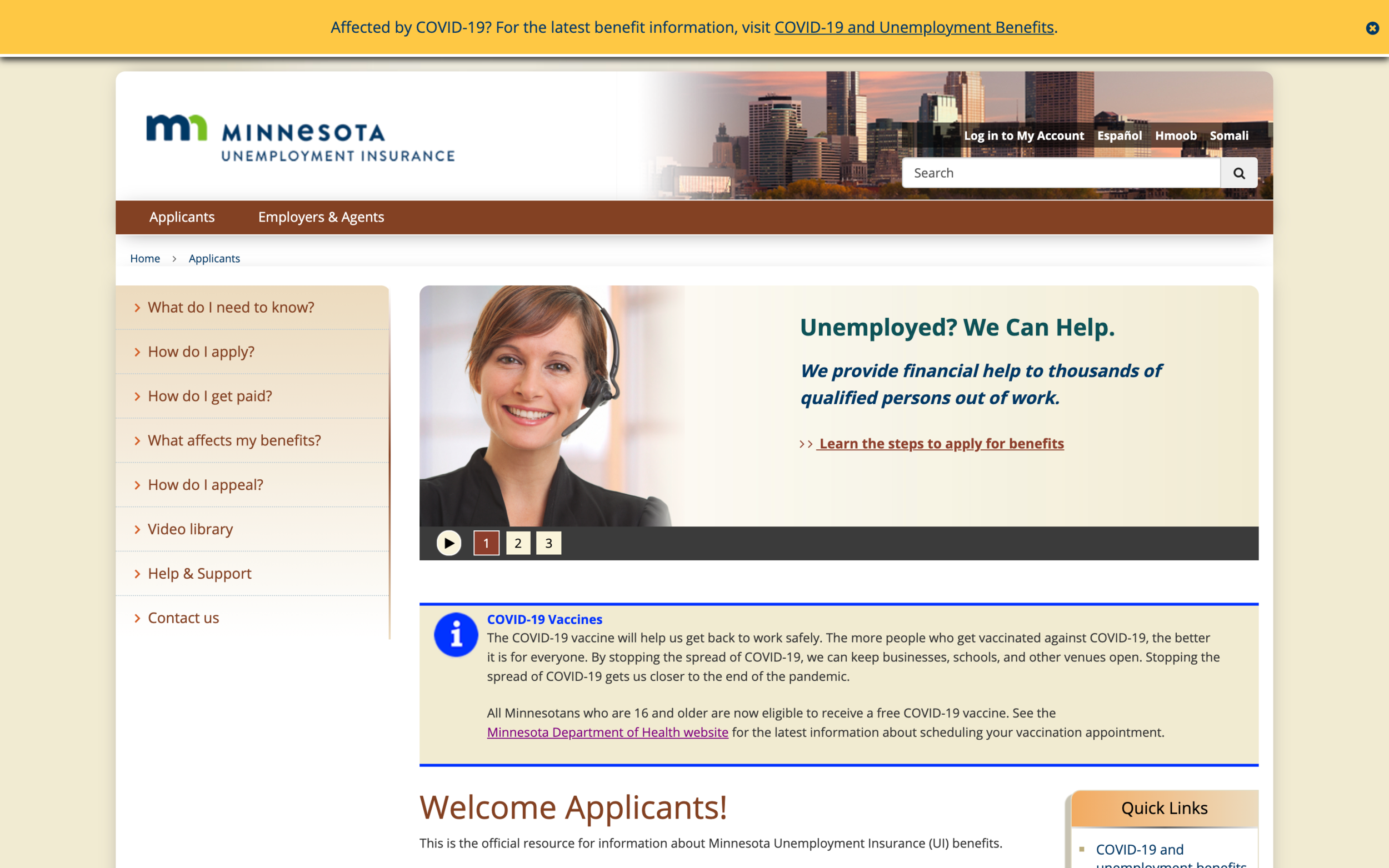
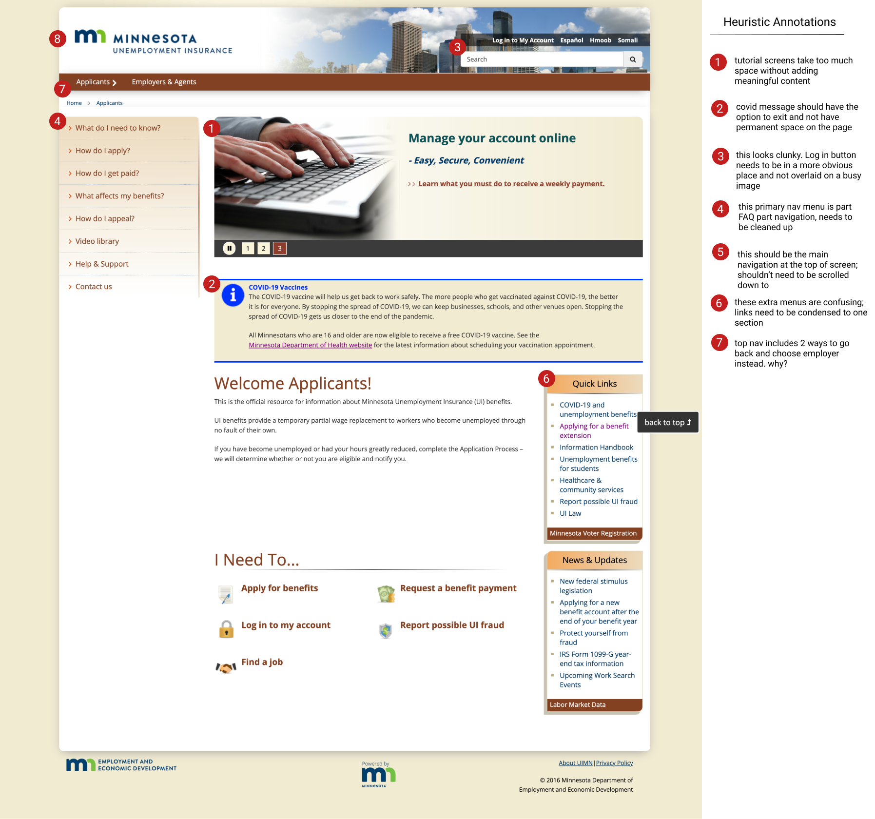
Research
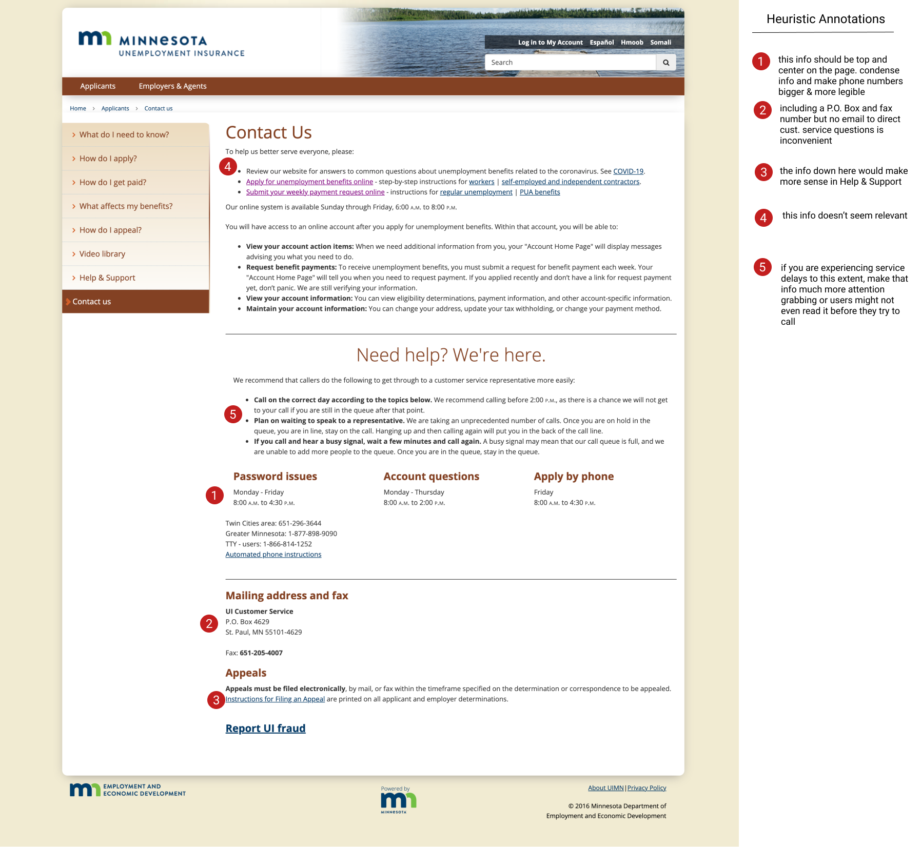
I began with a heuristic evaluation to assess the current accessibility and LATCH characteristics of uimn.org. These were my top redline annotations:
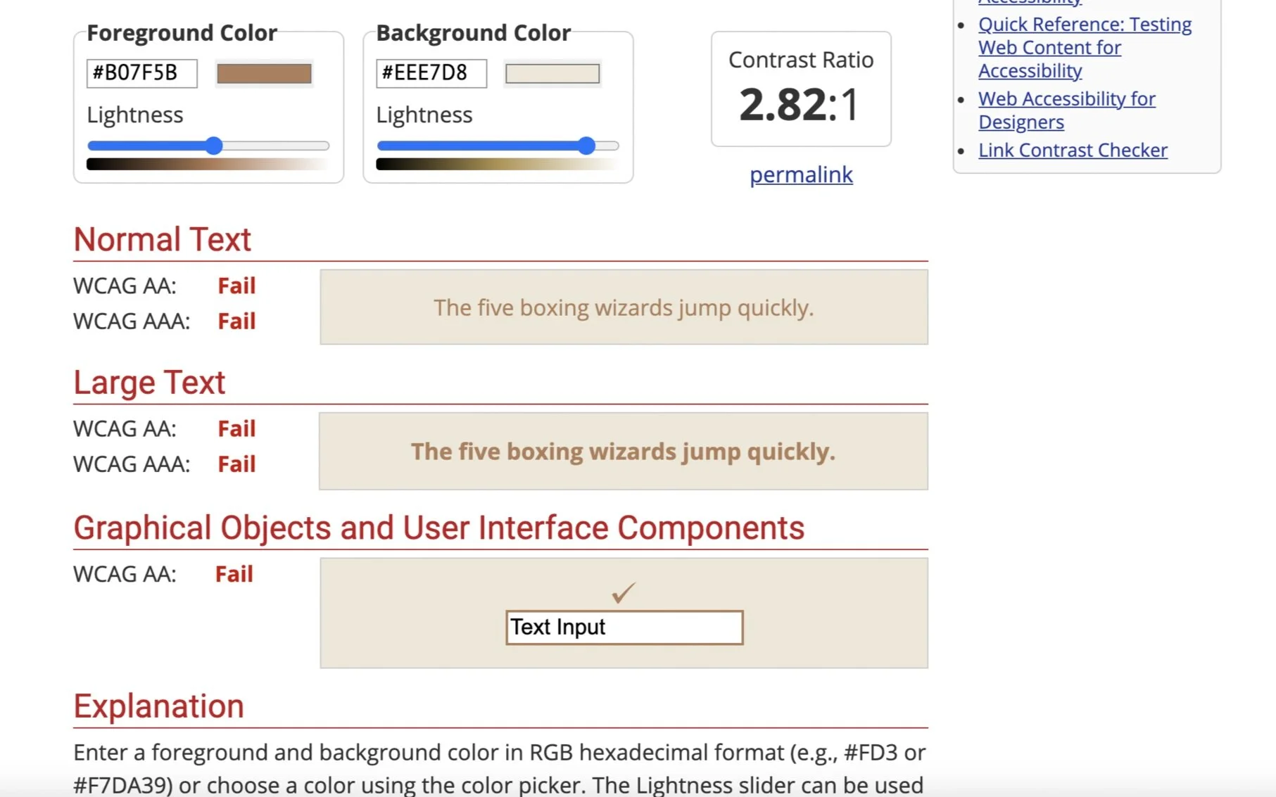
Brown & beige color scheme lacks contrast and is hard to read
Top and side navigation don’t reflect what users are most likely to be using the most
Duplicate menus throughout the site
Log in button is hard to see
Contact info & help is not present throughout site
Inconsistent visual theme & redundant text
I then conducted usability tests on the existing website. It was an open ended test where participants were encouraged to think out loud and give feedback about what they were seeing as they went through the tasks. Based on my tests, the following needed updates:
Add contact info at the footer of every page
Update top navigation to include essential tasks
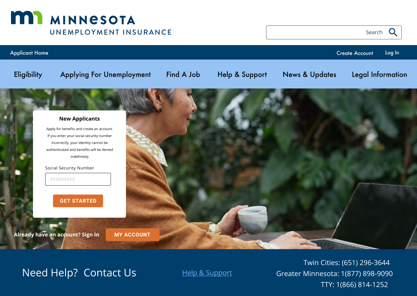
Add “apply for benefits” button next to log in; increase visibility of log in button
Reemployment tools need to be easier to find and highlight job listings
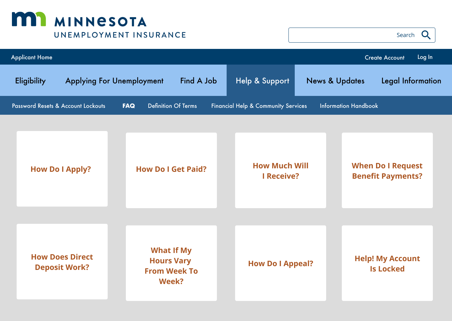
“Help & Support” and “Contact Us” pages need to be reworked
Definition & Ideation
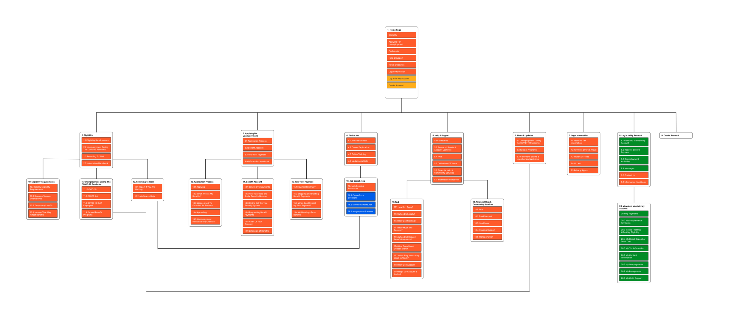
I completed a card sort of the site navigation and used the results to create a new sitemap. My priority was that information be easy to find for users instead of scattered around the website.
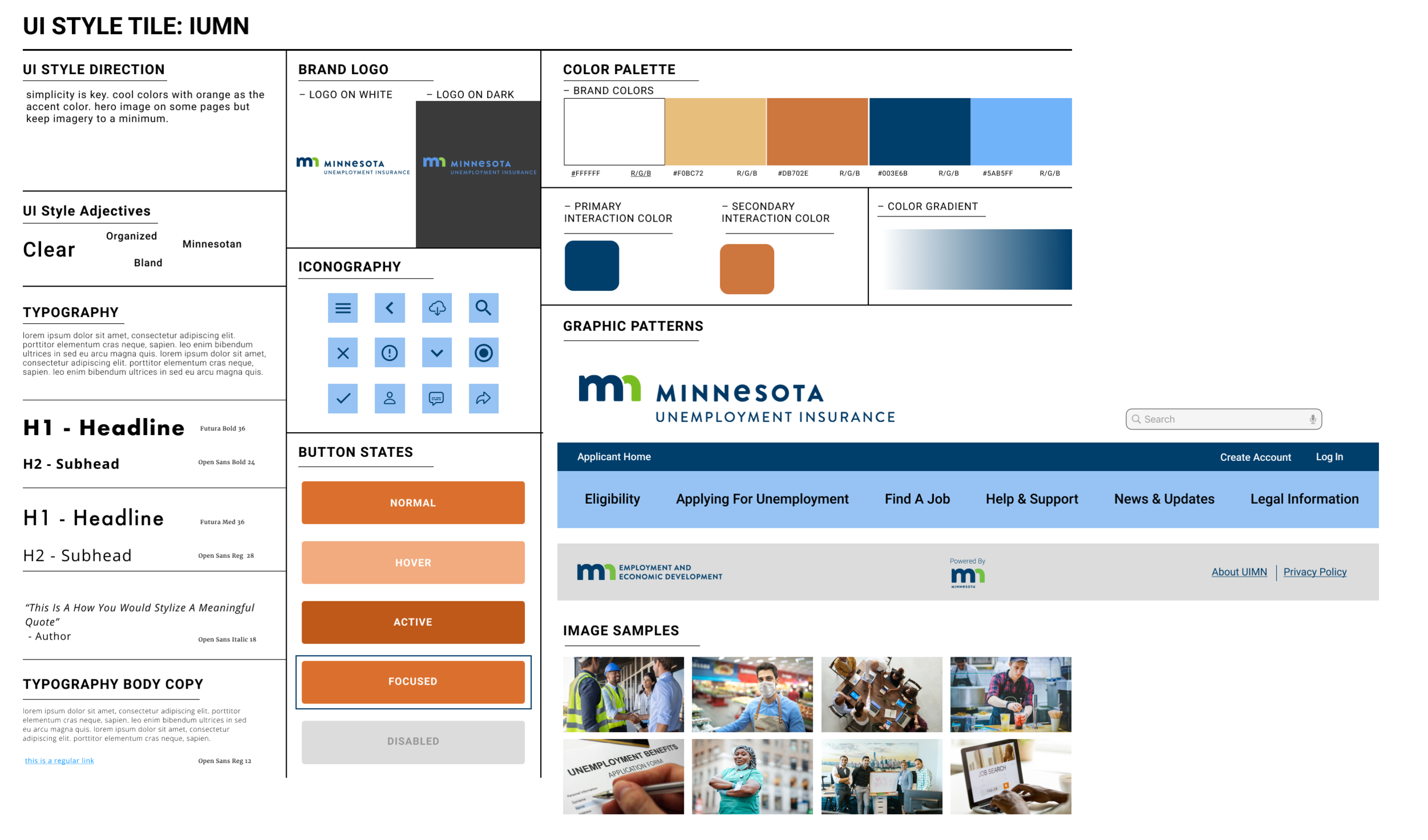
With the information architecture sorted, I began to develop an updated visual style for my new website. I focused on brand voice and mood to inform my design choices.
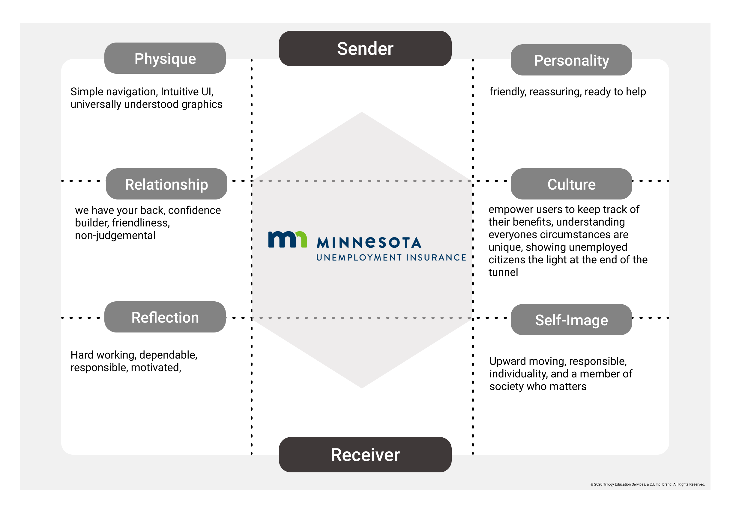
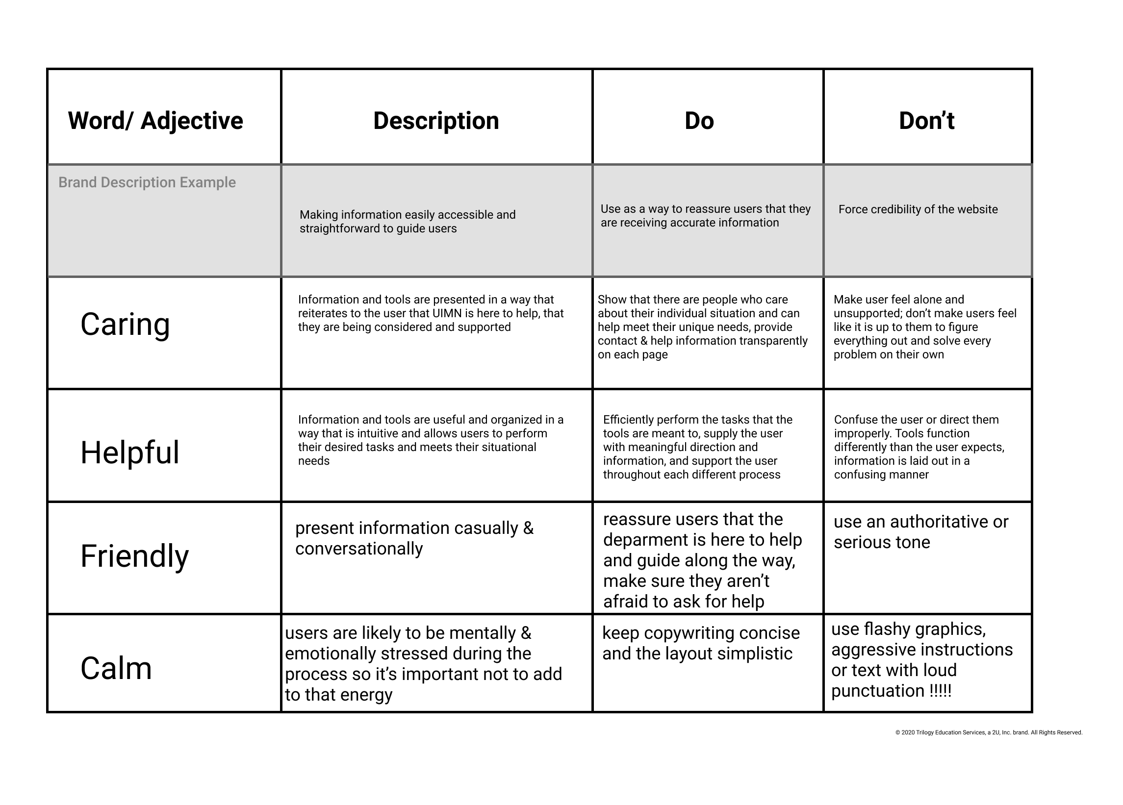
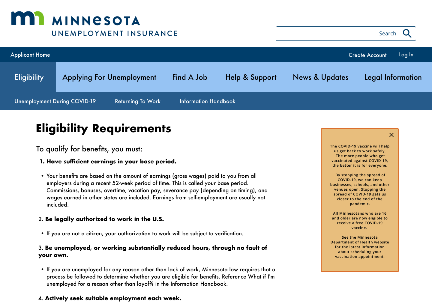
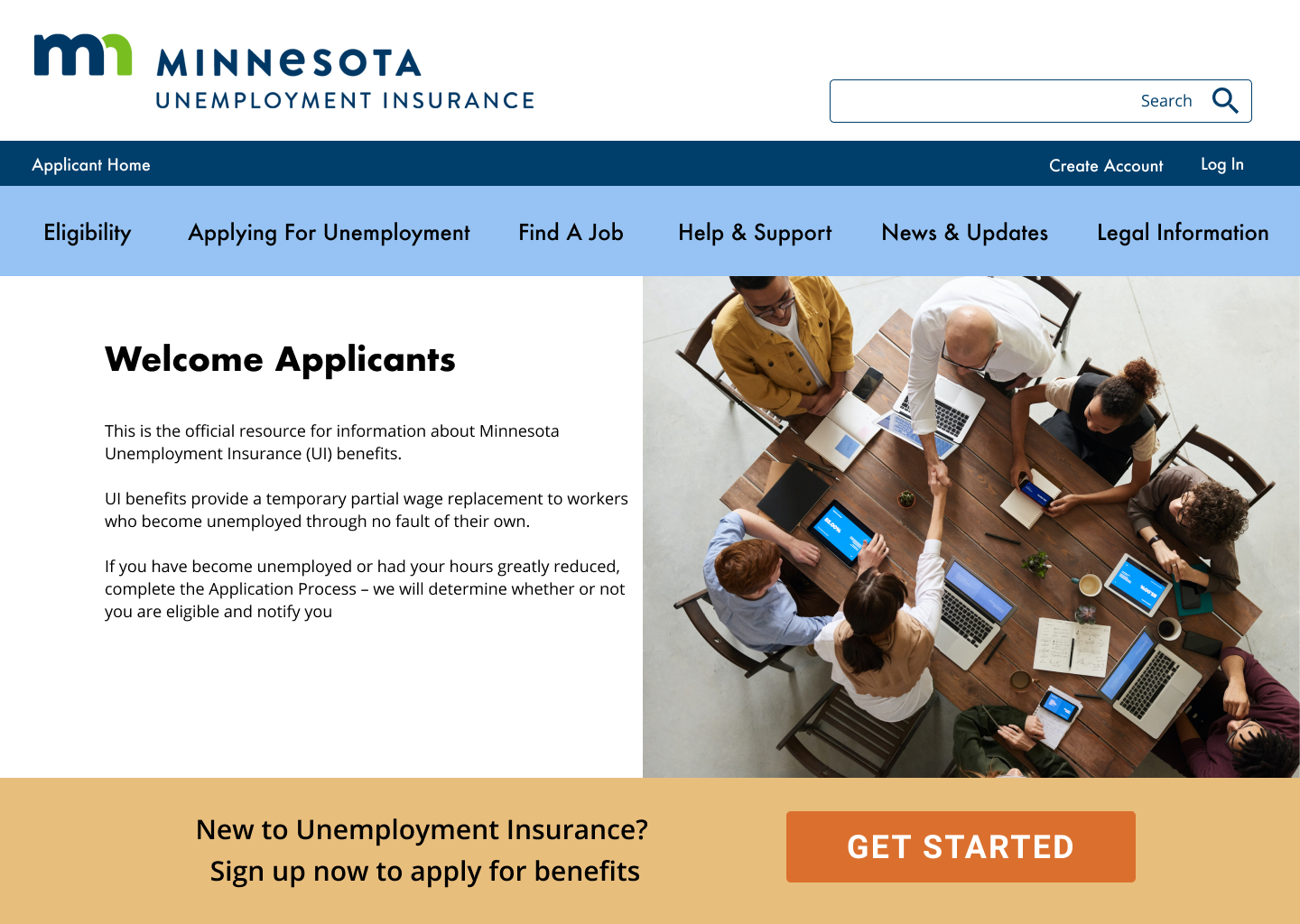
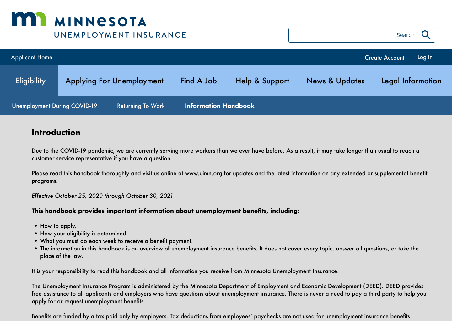
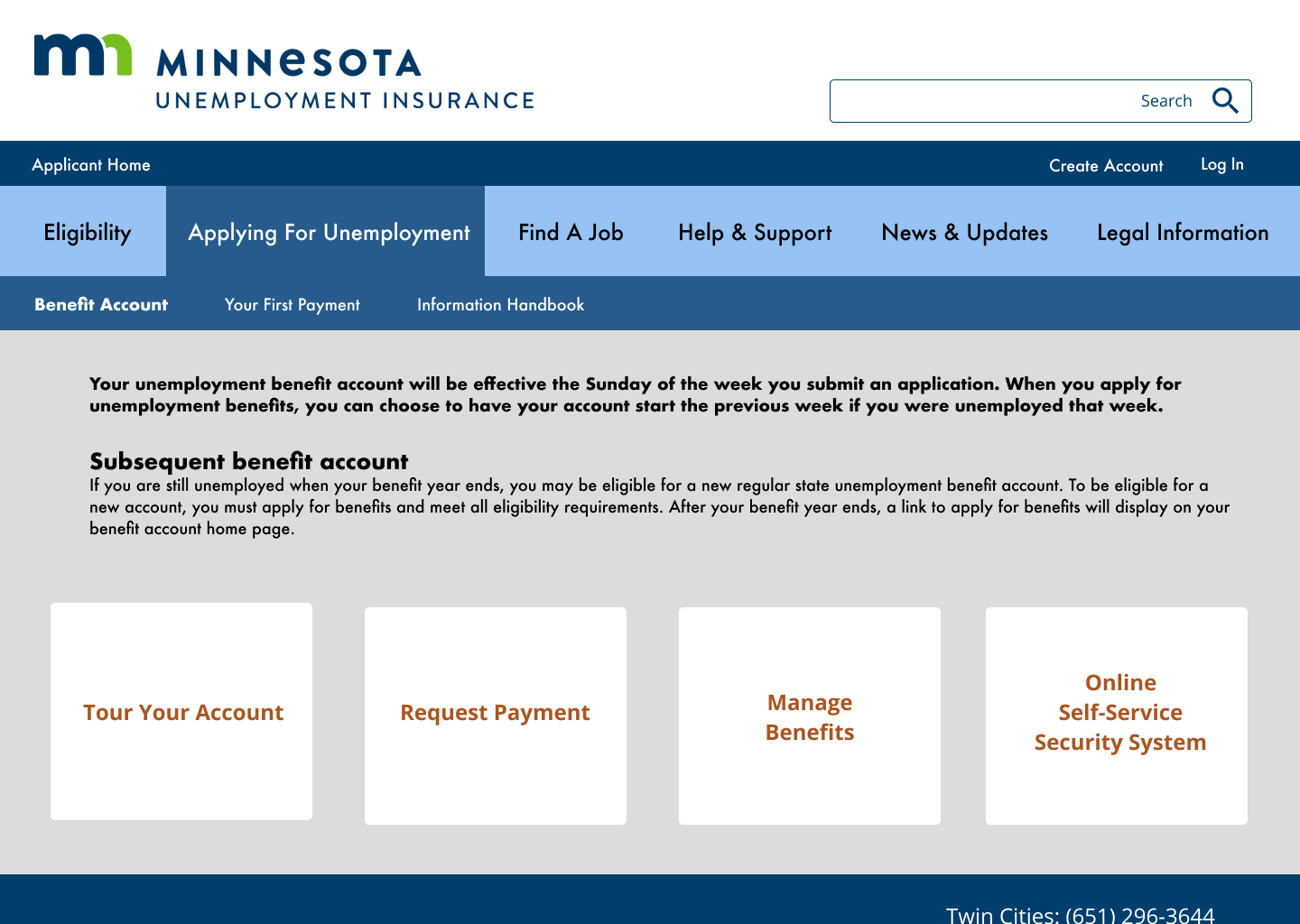
I chose a complementary color scheme using blues and oranges to create contrast and visual interest, incorporating blue most often in alignment with other Minnesota State branding & websites.
I chose sans-serif font families for legibility, designed button styles, selected hero images, and created a new nav bar. My design is as simple as possible to be accessible to the diverse user segment of a government website.
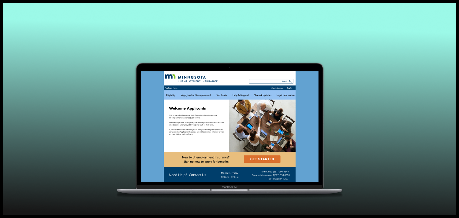
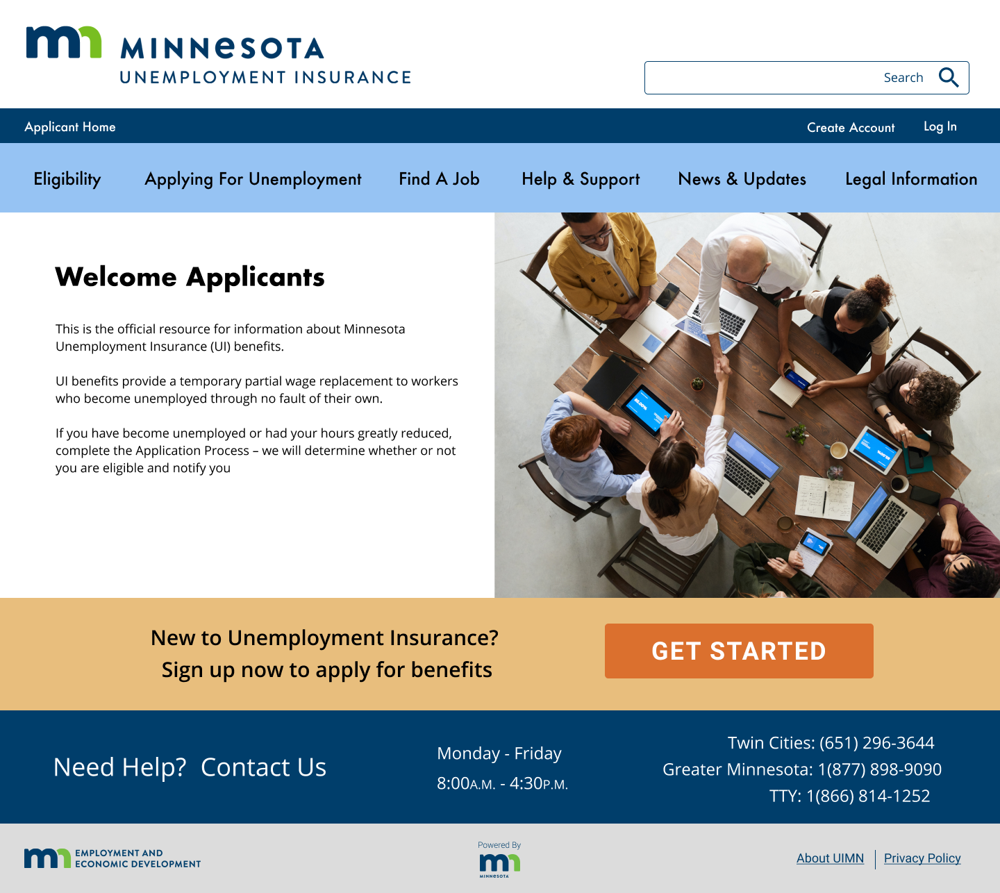
Prototyping
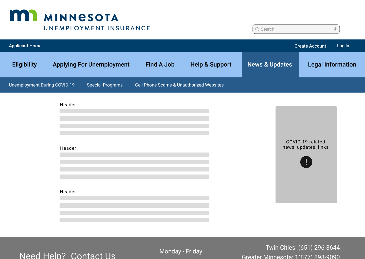
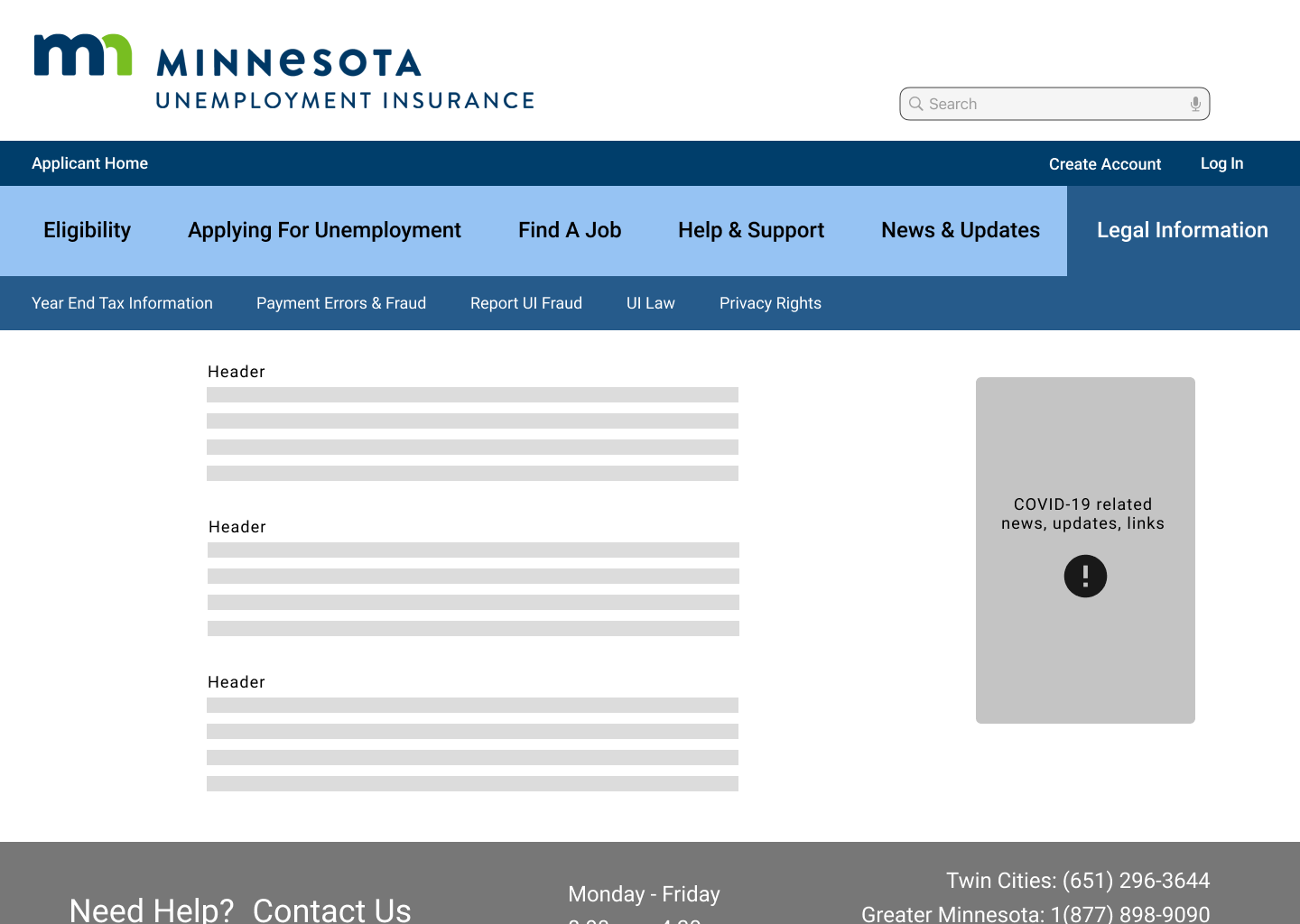
I developed wireframes for desktop & mobile versions of the site focusing on the navigation first and foremost. Once the primary and secondary navigation was finished I blocked out content based on user need; what were the most likely user flows completed by visitors to the website?
Applying for unemployment benefits & creating a new account
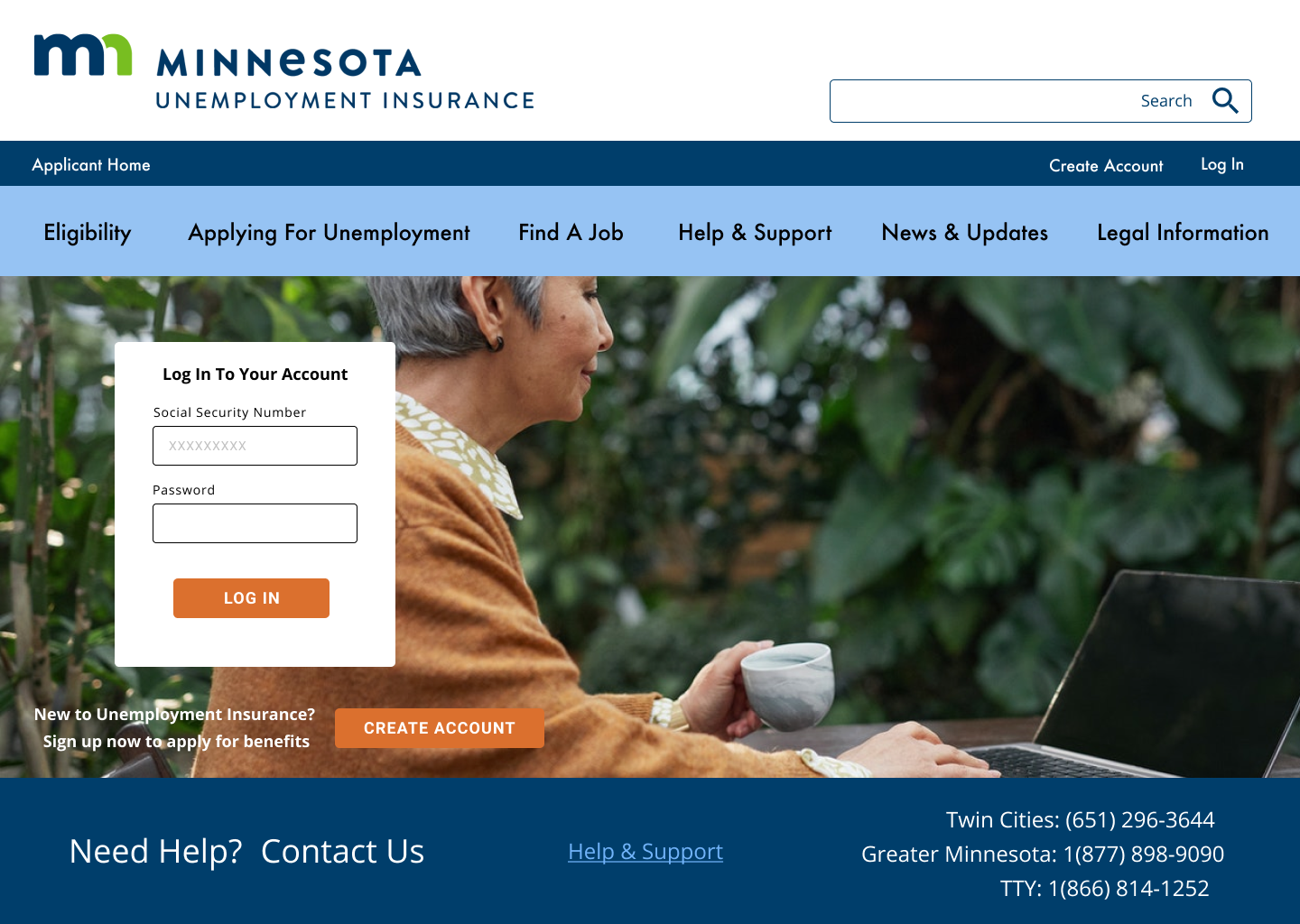
Logging in to an existing account
Using reemployment tools to search for a new job
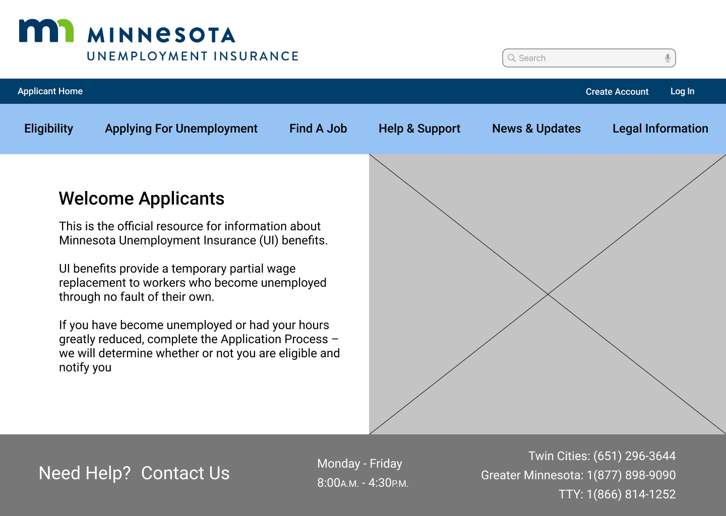
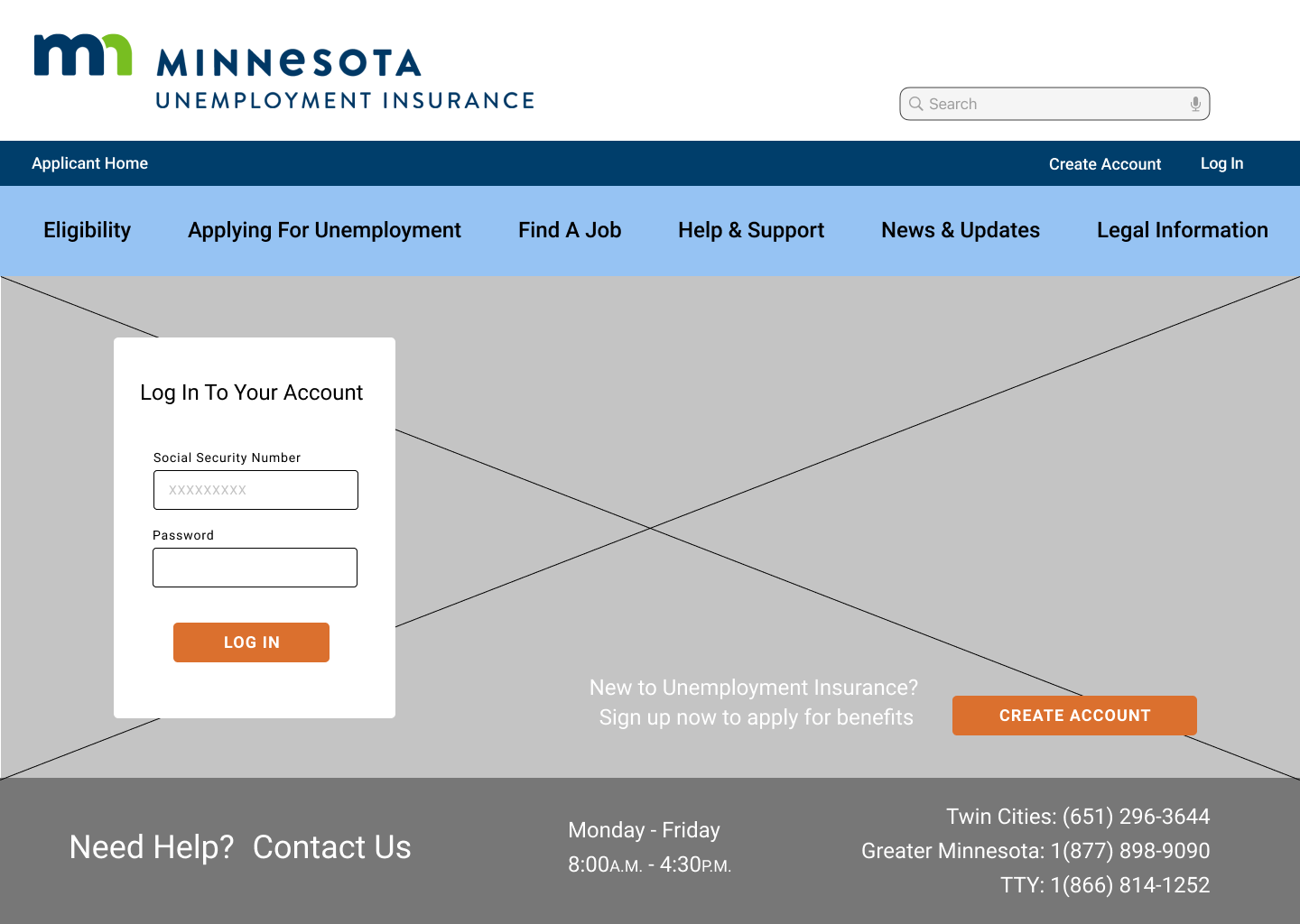
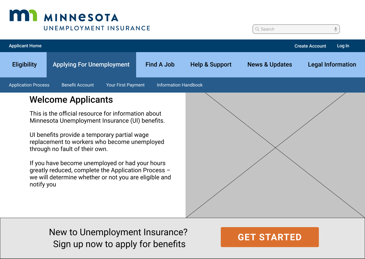
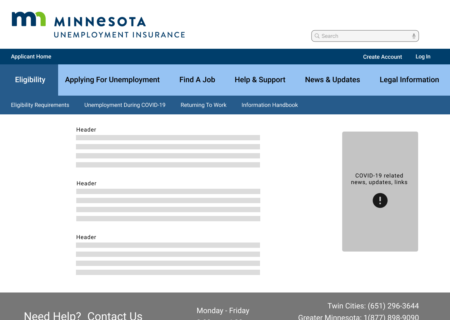
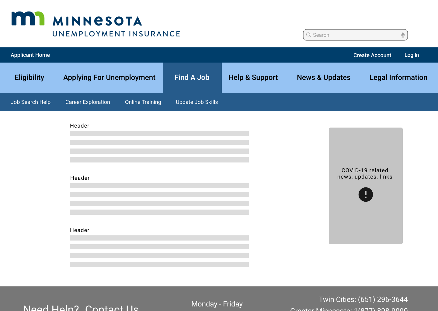
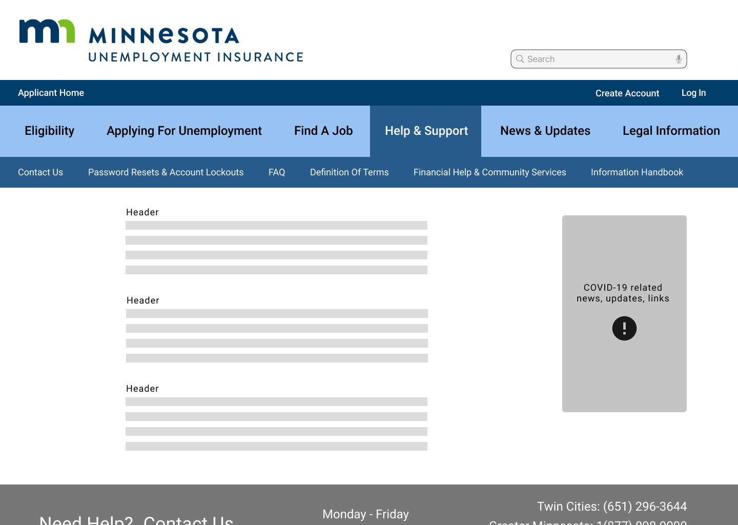
Once the content was laid out, I went through and added copy and styling for all the connecting pages.
I used copy direct from the website but made edits and condensed multiple pages worth of copy into only the most relevant information. I turned these screens into a hi-fidelity prototype and conducted tests.
The biggest frustration during testing came from the fact that there is no virtual way to contact this department; users must call, fax, or mail UIMN to get help. I added a link to the Help & Support FAQ page in the contact footer to try to help alleviate this frustration.
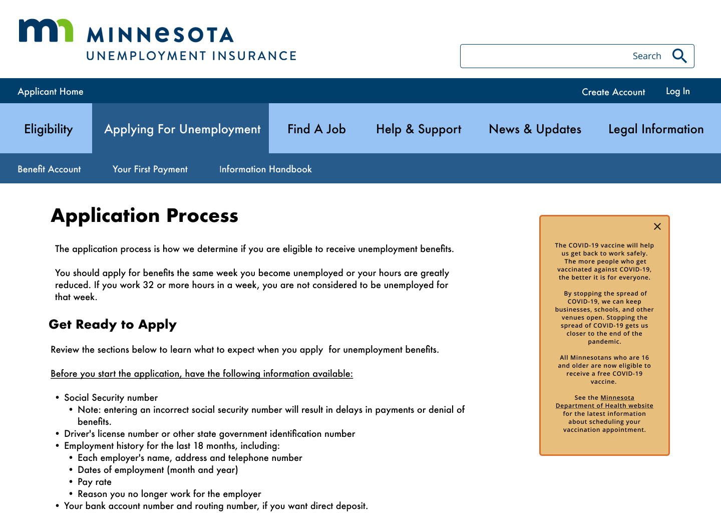
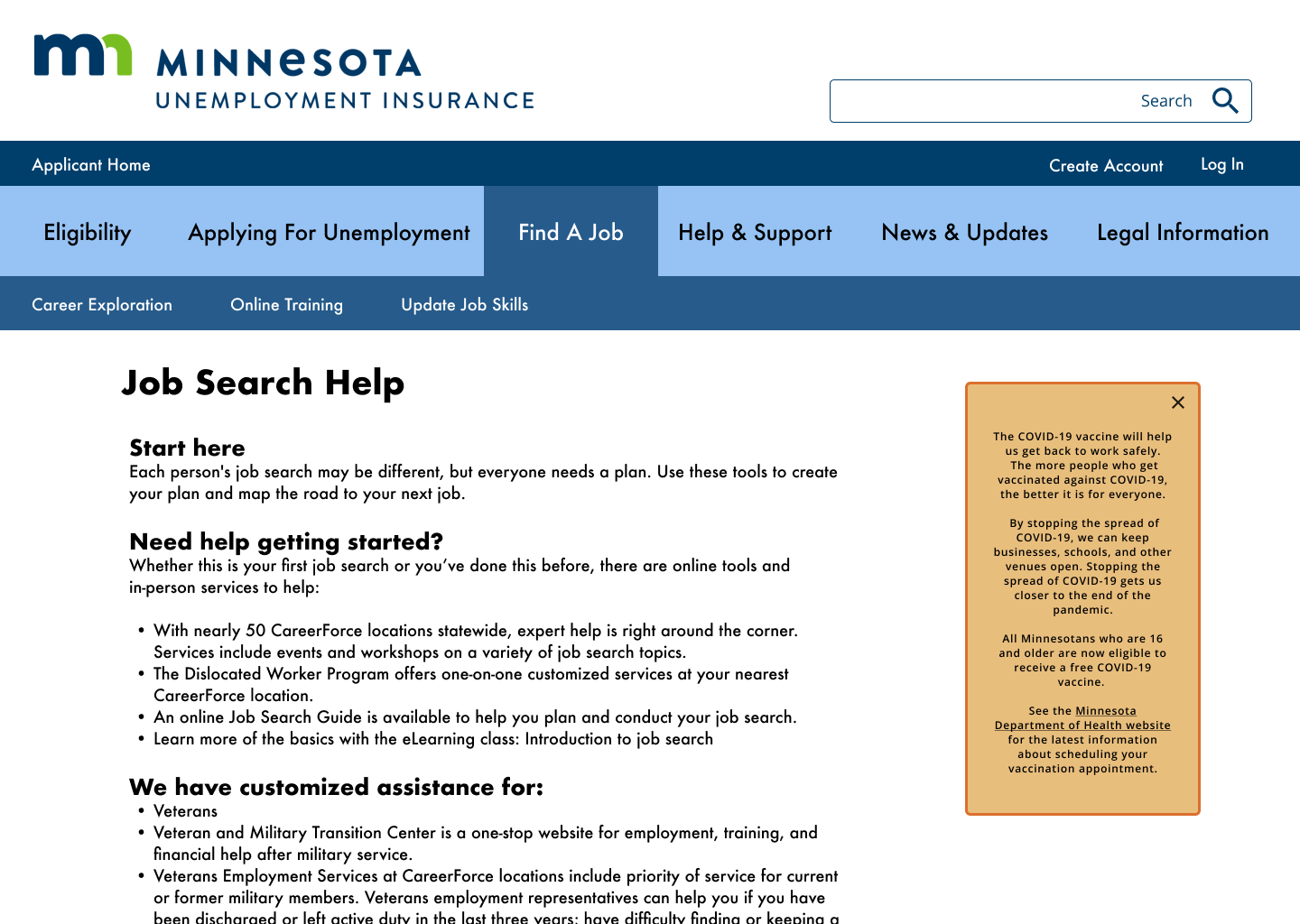
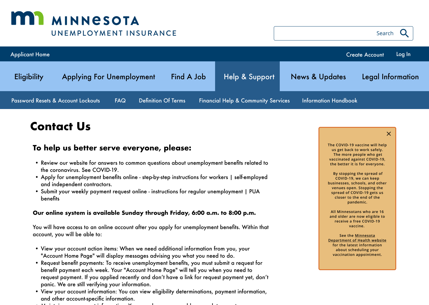
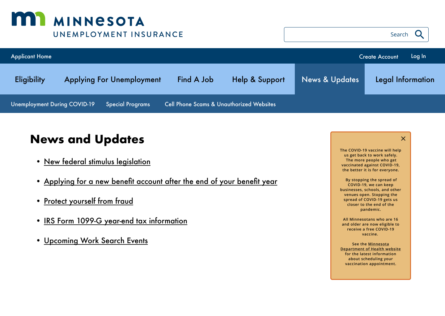
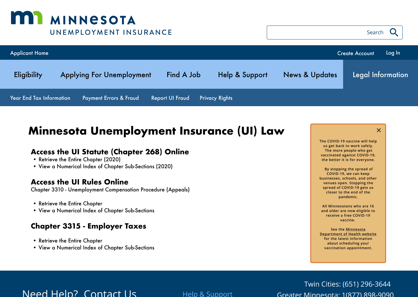
Here are some finished frames from the prototype:
Obvious next steps for this prototype would be to pursue accessibility concerns; testing whether the design is successful with screen readers across devices, further testing the usability of the new navigation, and exploring ways to provide the site in multiple languages.