Radio K: Real College Radio
-
The Problem
Radio K, a Twin Cities based college radio station, has navigation & content hierarchy problems on its website. Users want to connect with local music but also expect a seamless streaming experience
-
The Solution
Emphasize the streaming feature of the website and restructure the content to increase listener following and potentially increase donations to the organization as a result
-
My role
Scrum Master, Researcher, UX/UI Designer
Group Project
Tools: Miro, Zoom, Figma, Invision
Timeline: 3 Weeks
Vision Statement:
Radio K (KUOM) breaks the norms of most radio stations with its unconventional music programming and specialty shows. This college run radio station relies on listener support to operate. If we can increase listeners and website traffic to Radiok.org, this could lead to an increase in donations. How can we encourage streaming users who typically use services like Spotify and Apple Music to instead tune in to Radio K's streaming website for their music needs?
Research
Once we had our hypothesis for the redesign, we created a google forms survey and list of interview questions to determine how users are currently streaming music and what Radio K could be doing to attract more listeners. Each member of the group conducted interviews and pooled the responses into an affinity diagram which gave us these key findings:
Users love ad-free streaming services
Users want supporting local music to be easier
Users have ingrained habits and expectations for streaming music
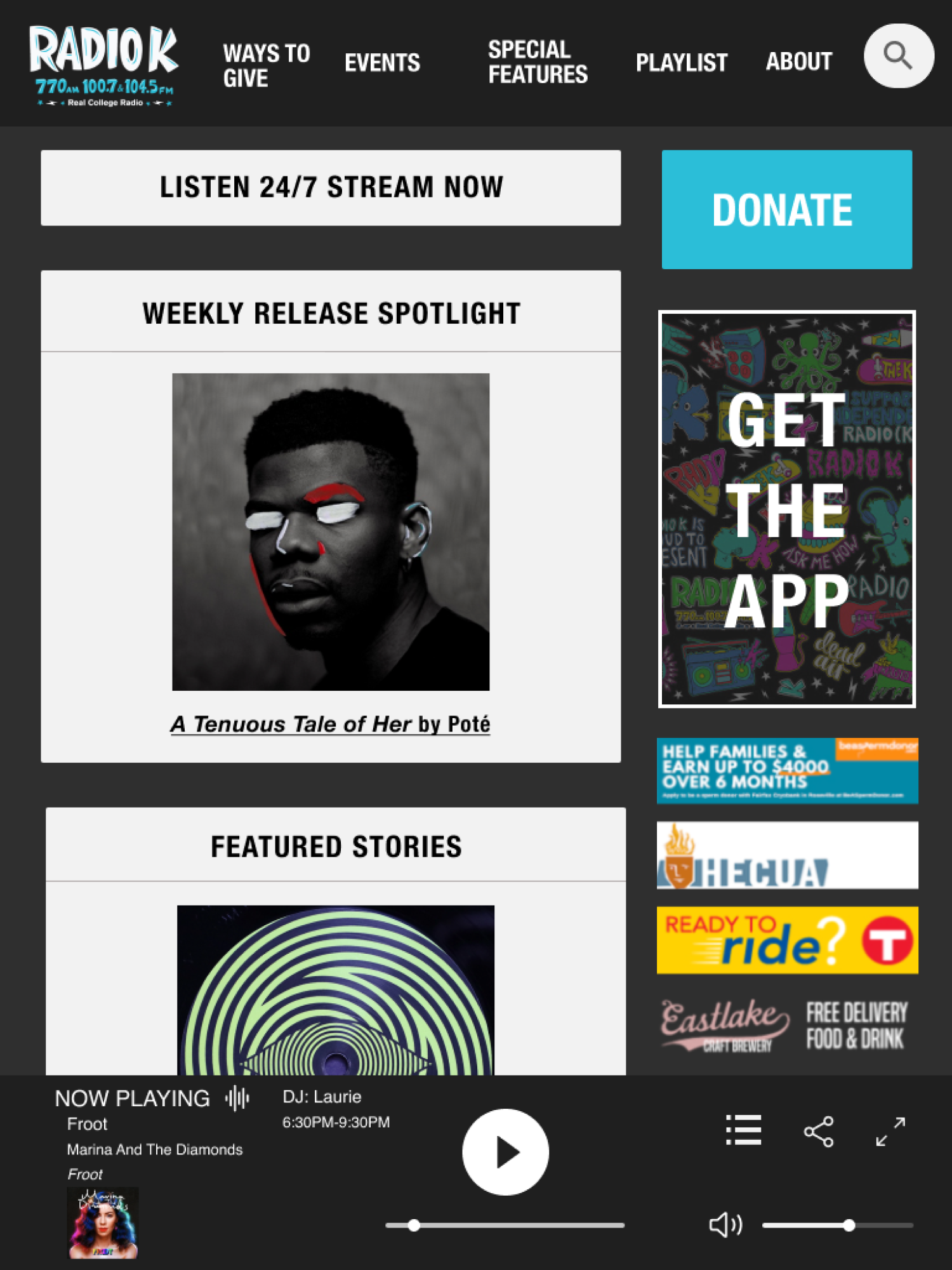
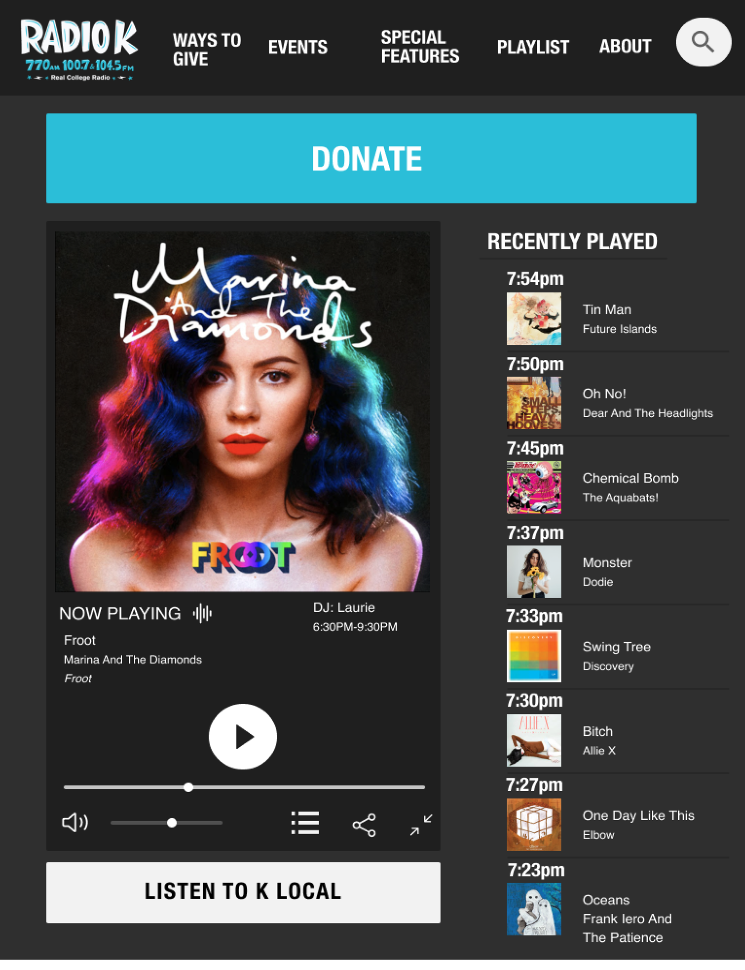
I conducted heuristic evaluations of the current site layout. I found their “donate” button is clearly emphasized, but that the rest of the content was disorganized. The home page is a grid with no clear hierarchy.
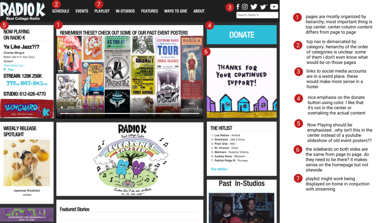
We conducted a user test on the usability of the homepage and found that users get so overwhelmed by the content options that they exit the site rather than figure out what to focus on. Radio K is driving away potential listeners due to poor Information Architecture. Another team member used the results of card sorting to condense the nav and create a new sitemap for us to work from.
We iterated our vision statement and created a new problem statement:
Users want more ways to engage with local music, but they also expect a glossy, seamless streaming experience. How can we encourage streaming users who typically use paid subscriptions to switch to Radio K in order to increase website traffic and donations for the organization?
Definition & Ideation
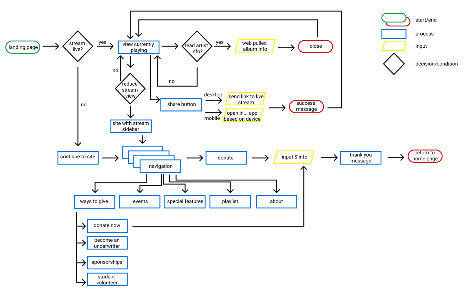
We brainstormed solutions using the “I like, I wish, What if” method and plugged those responses into a feature prioritization matrix. Overwhelmingly, users just wanted a more user friendly interface. We combined this need with our new sitemap to sketch out a user flow. Our flow focused on:
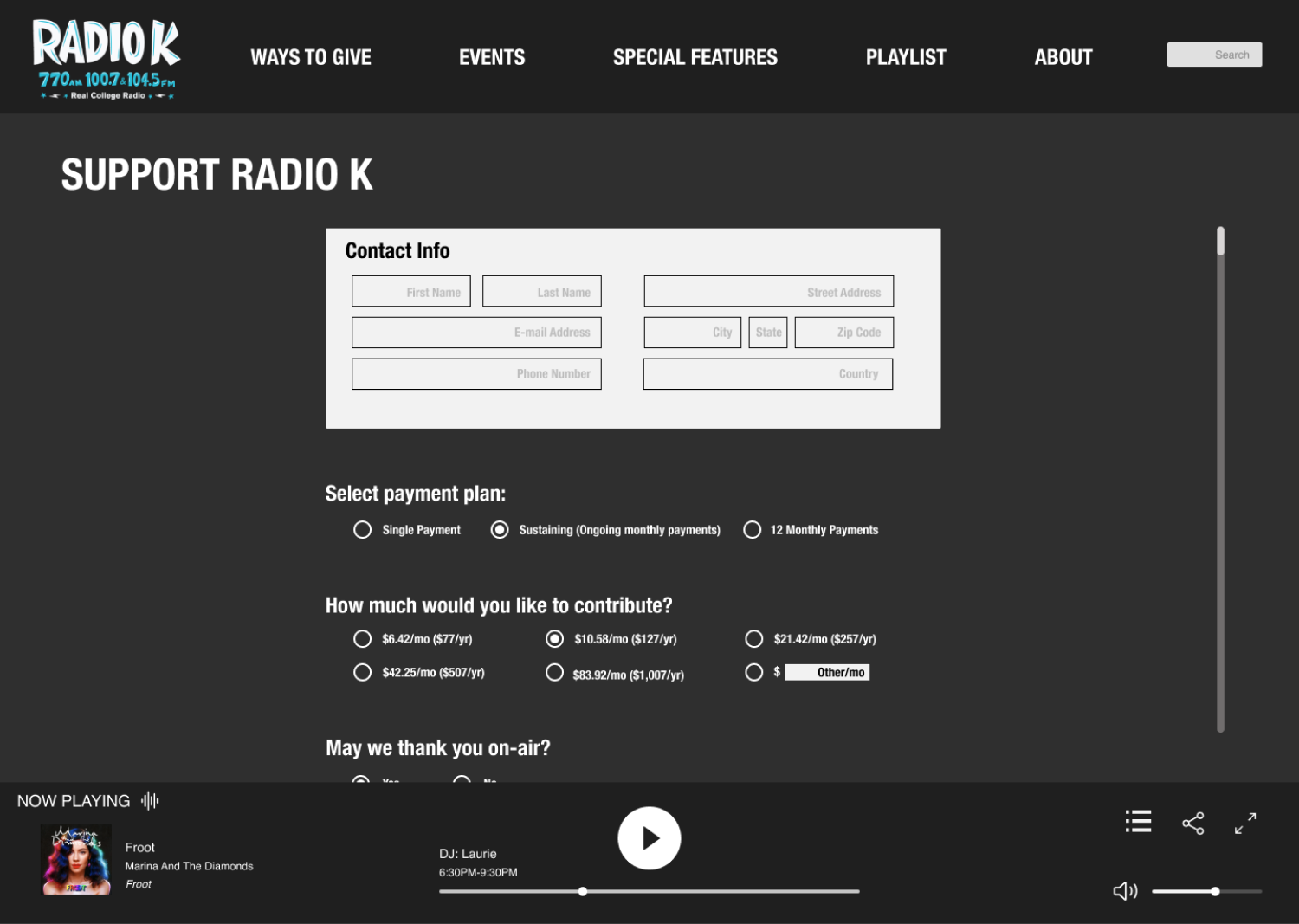
Live streaming
Donating
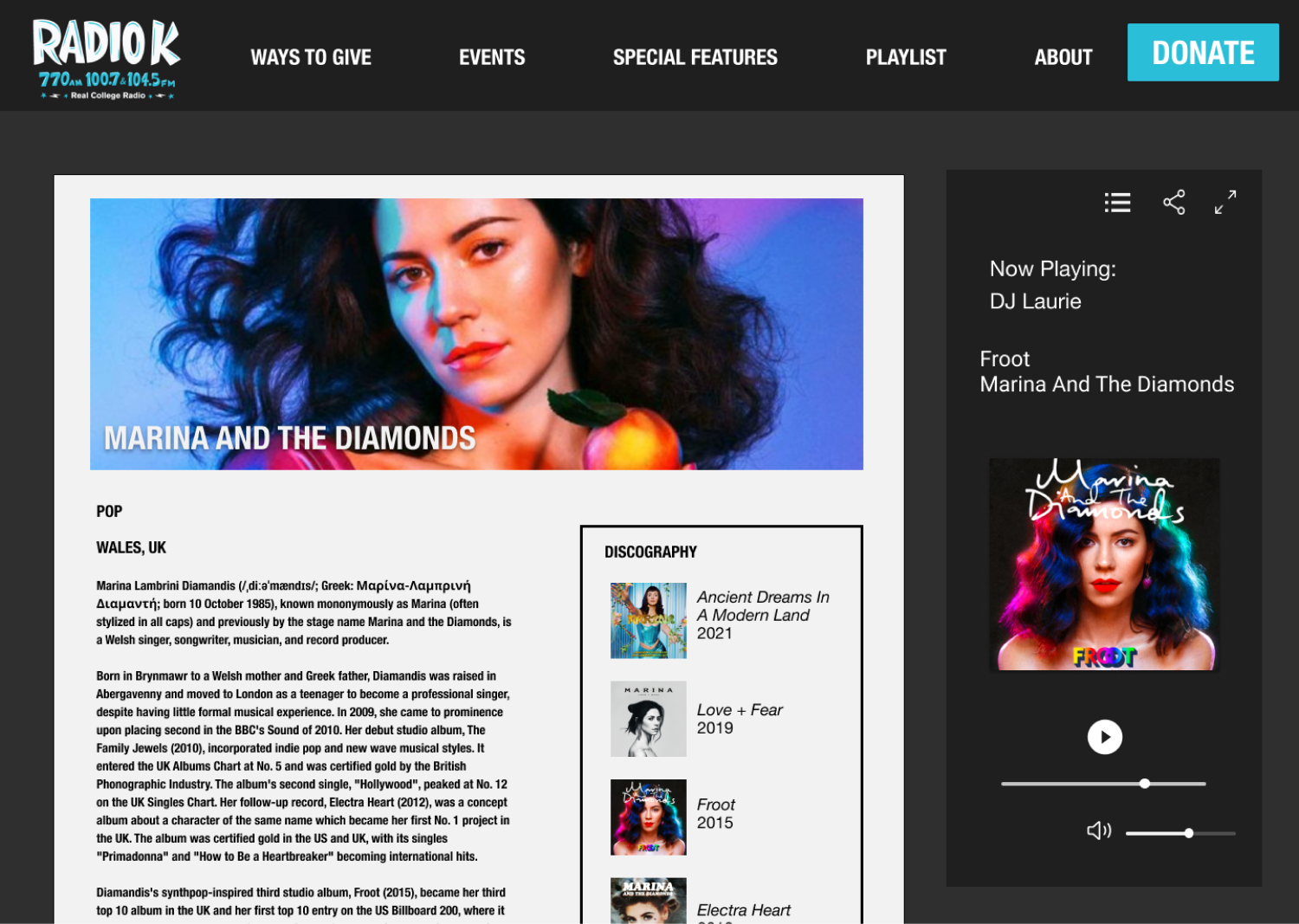
Learning about artists
Prototyping
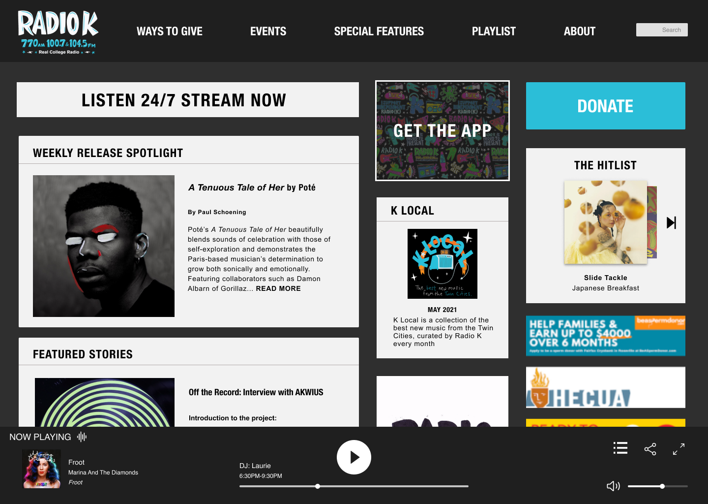
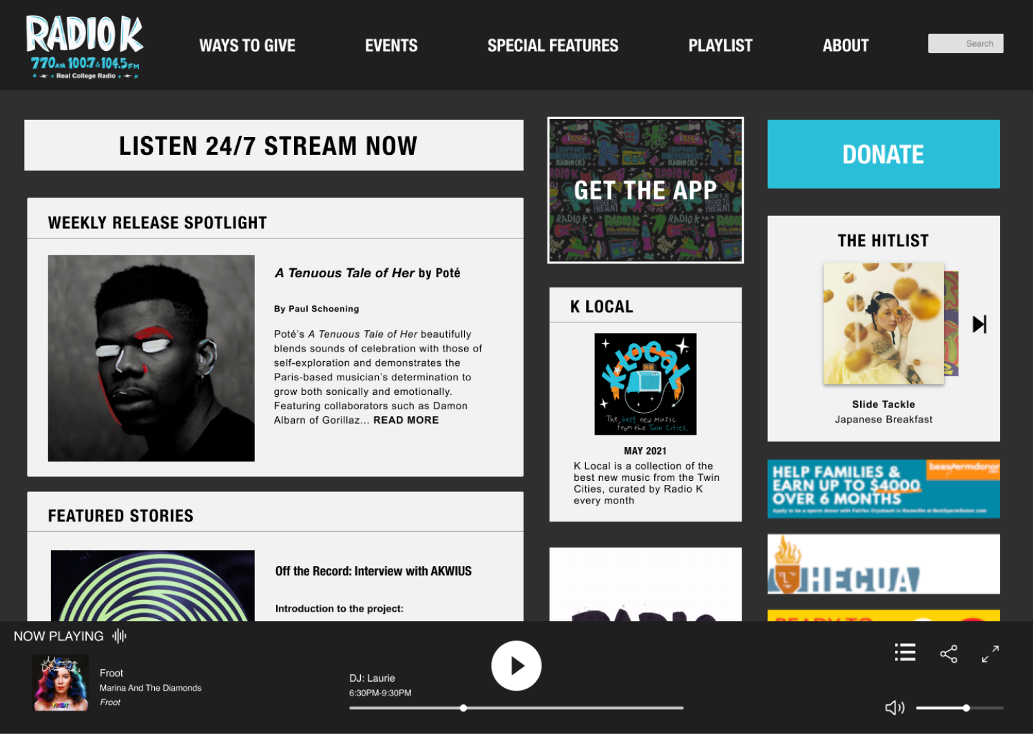
Each group member sketched ideas for the homepage and media player, then came together and used the best elements from each to start wire-framing. Radio K has strong branding, colors, and accessible text, so we decided not to make any major style changes. Visual elements we planned to incorporate more of were album art and a new streaming module based on current streaming apps like Spotify and Youtube Music. We were able to jump straight to mid-fidelity wireframes since all the brand visuals were decided.
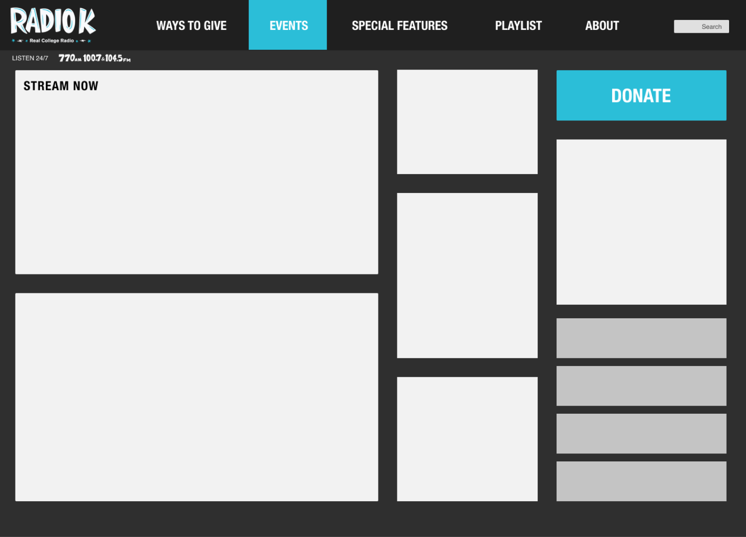
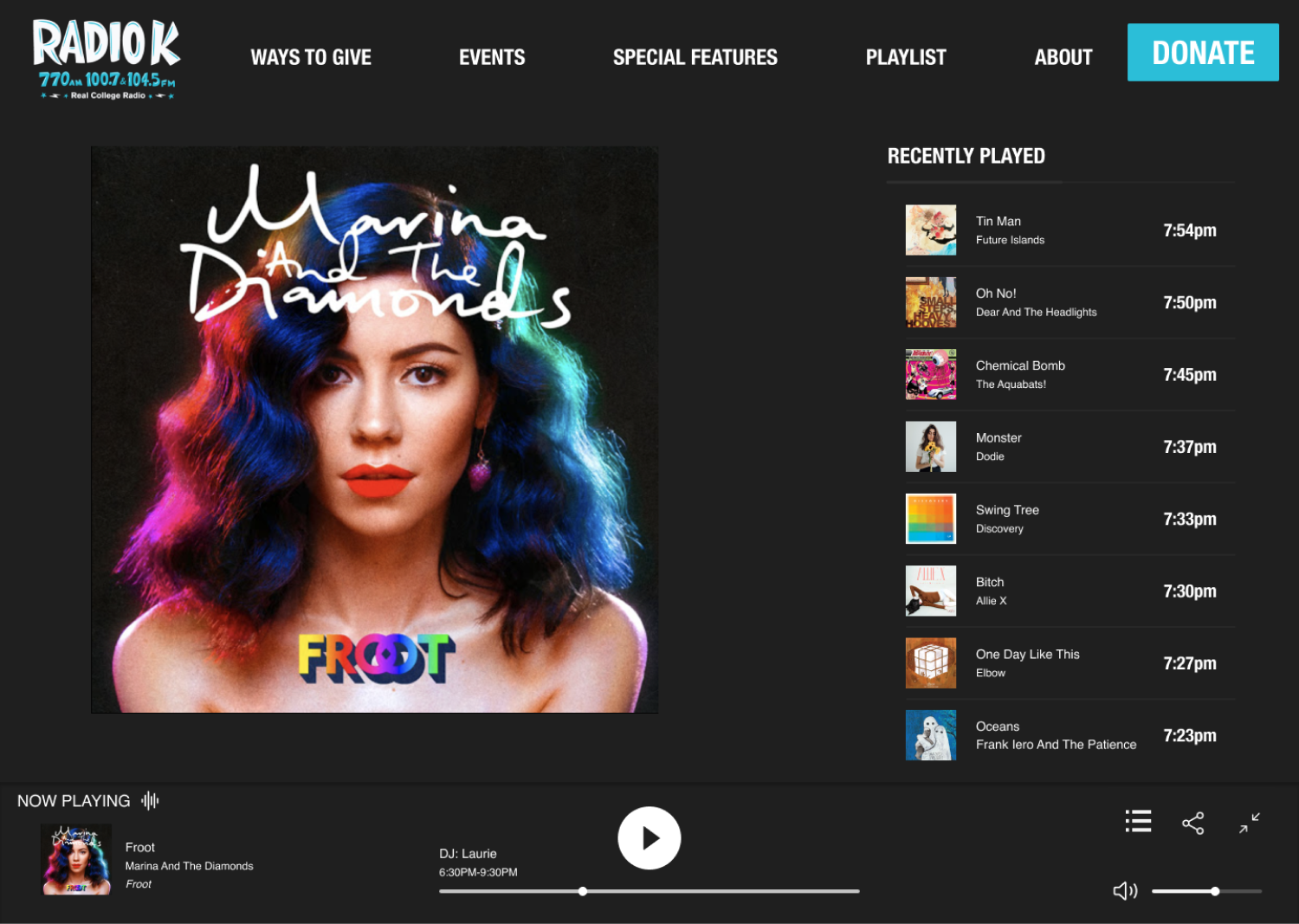
To reorganize the content hierarchy, we were inspired by bulletin boards which are so often present on college campuses. We kept the grid style, but rearranged the sizes of the cards and widened the margins. Our new layout takes the eye through a natural Z pattern and feels less cramped.
We chose to emphasize the donate button and live streaming button as the most important elements. It was important to us to design our wireframes so that the media player could be present on the screen at all times without being a distraction, as it appears in streaming services users are already familiar with. With the structure organized, we just filled in content from Radio K and our own music libraries.
Testing
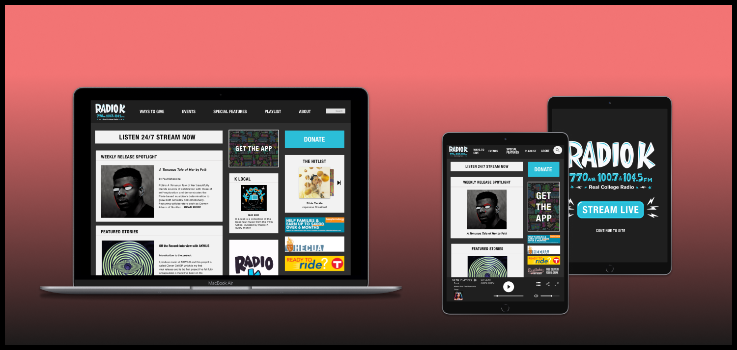
We worked as a group to turn our hi-fidelity wireframes into a prototype of our user flows. Initial tests told us that our connections were messy and inconsistent, and that our donation flow was flawed. We iterated on these findings by double checking our navigation, connections, and adding a scroll bar to the donate page to help users finish the flow. Once our web prototype was completed, we created tablet wireframes of our design. The modularity of the grid design makes this solution easily adaptable to different screen sizes.
Going forward, we would like to get in contact with the organization to see if they have any business considerations or insights that could better inform the hierarchy we designed. Following further research interviews, we would re-examine our sitemap and build out wireframes for the entire site. Next steps from there would be to create a mobile prototype to round out our responsive designs.